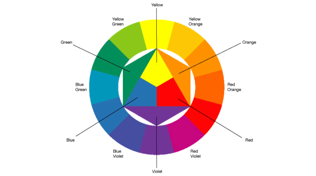
The Color Wheel is a great tool for artists to use to make choices about color. It tells us how to mix colors and which to choose to create harmony or contrast in a work of art.
The Color Wheel is made of 12 colors (also known as hues).
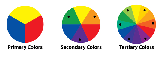
The primary colors (red, yellow, and blue) are used to make all the colors in the wheel. Combinations of each color create the secondary and tertiary colors.
The secondary colors (orange, green, and violet) are made from mixing two primary colors together.
The tertiary colors (red-orange, yellow-orange, yellow-green, blue-green, blue-violet, red-violet) are the in-between colors. They are created by mixing a primary and a secondary color together.
Vocabulary to know:
Hue: A color (red, orange, yellow...)
Saturation: The intensity of a color
Complimentary Colors: Colors across from each other on the color wheel (used to create contrast in a work of art)
Analogous Colors: 2-3 colors next to each other on the color wheel (used to create harmony in a work of art)
Primary Colors: Red, Yellow, and Blue (used to mix all other colors)
Secondary Colors: Orange, Green, Violet (made by mixing 2 primary colors)
Tertiary Colors: The "in-between" colors (made by mixing a primary and a secondary color)
Media: What an artist uses to create their work of art (pencil, pen, paint, clay)
Contrast: The arrangement of opposite elements
Harmony: A sense of peace or togetherness in a work of art
Transparency: The quality of being see-through
Opaque: Allowing no light to shine through
Value: The lightness or darkness of a color
Tint: A lighter value of a color
Shade: A darker value of a color
